Case Study
Problem:
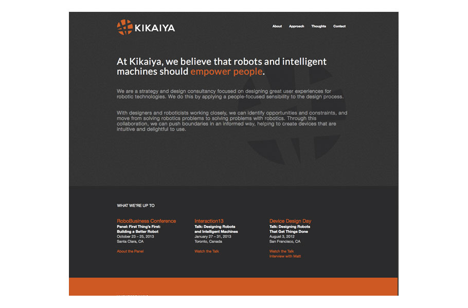
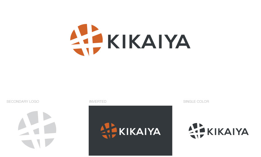
Kikaiya isa strategy and design consultancy founded by roboticists and designers, committed to creating impact by improving the user experience through the interplay of robotic technology and people-focused design.
Kikaiya means “Machine House.” Did not want the symbol to be over-the-top MACHINE HOUSE. You know, with a house and gears or something like that? We wanted to keep a positive twist to the logo. Three words we want people to feel when they see the branding: Bold, Thoughtful, Empowering. Client Likes: Saturated colors, red, black, white, orange, purple. Client disliked: Facebook blue, pink, pastels, yellow (as a major color), neon/brights (again as major color)
Solution:
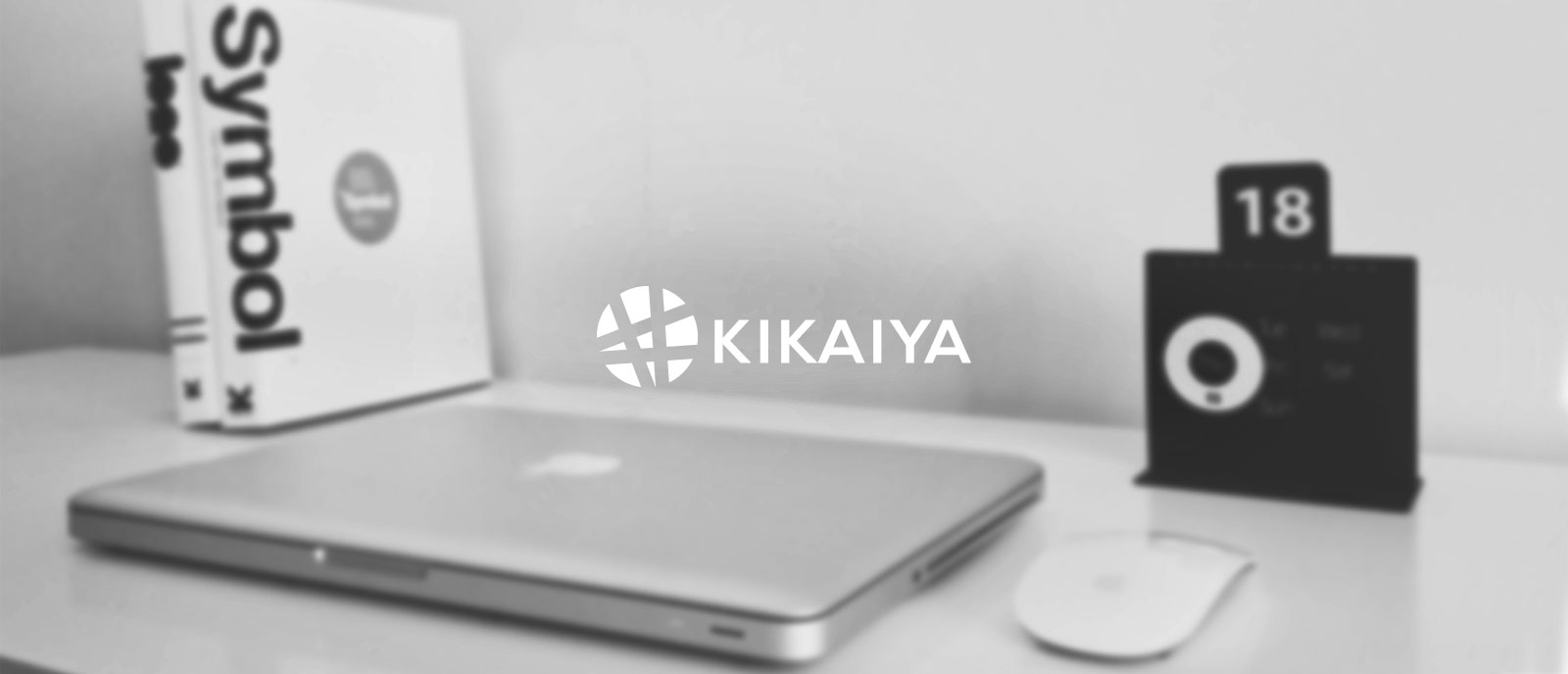
Use the Japanese symbol for “YA” in the logo mark. But, not using the exact symbol, just use some of the characteristics from the mark. Use a nice bold orange and contrasting charcoal for our color palette to make a bold impression. Keep everything clear, crisp and simple.
Identity
Color Palette